LMS Content Integration
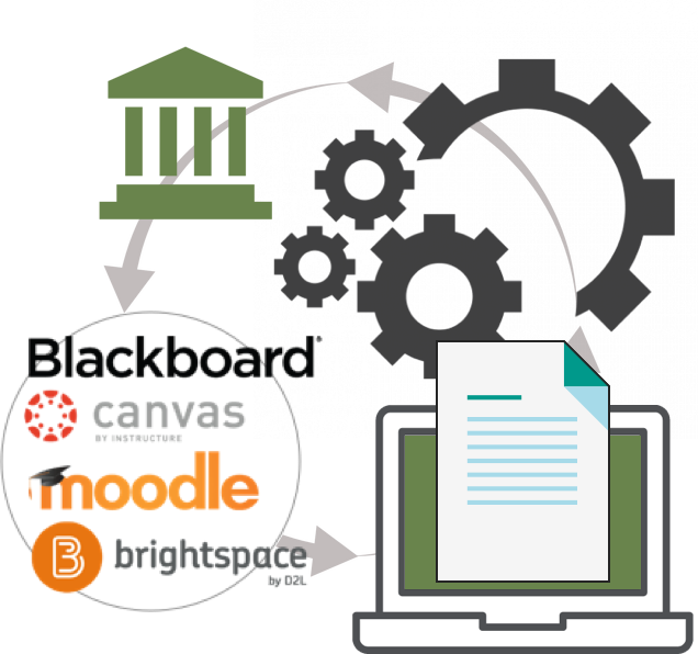
Providing administrators and educators seamless search, discovery, adoption, and re-use of next-generation digital content from within the Learning Management System (LMS) environments used to teach their higher education courses.
ROLE
Senior UX Product Owner
Sole UX Lead
Interaction & Visual Design
TEAM
Product Management (4)
UI Designers
Overseas Development teams (4)
Research Specialist
Dedicated UA Writer
DURATION
March 2016 - June 2020
RELEASES
Iterative/Ongoing
PROBLEM
We literally had educators jumping through windows.
The current onboarding experience opened multiple tabs and windows to complete the basic task of adding Courseware, Etexts, and Learning Apps to their courses.
The individual pages had their own URLs, styles, headers, footers, and visual elements. The brand was non-existent.
The user journey was disjointed and led to a decline in North American adoptions of our new product lines.
We currently held 16% of the market share.
SOLUTION
Let’s not do that!
Utilize APIs and Components to deliver a seamless, single-page experience inside of the required iFrame used to integrate services and capabilities within LMS environments.
UNDERSTANDING THE NEEDS
Interviews and conversations.
Partnering with Research Specialists, interviews were conducted and recorded with groups of admins and educators who currently used our products. They were asked to walk through the current onboarding experience and voice their thoughts and pain points.
Conversations were documented by product owners and management at multiple national education conferences. University educators were questioned on why or why not they would adopt our products.
Existing Customers
Although the content met their learning objectives. The research surfaced frustration with the time on task and complex window management.
What mattered
Simplifying the current onboarding process
Time on task
Courseware Integration from within their school websites.
Customers not using our products
The complexity of onboarding our products and lack of integration services was enough to consider other publishers.
What Mattered
Simple onboarding and integration
Content that met learning objectives
Time on task
Setting up and teaching courses from within their school websites
EARLY COLLABORATION
Setting up the roadmap
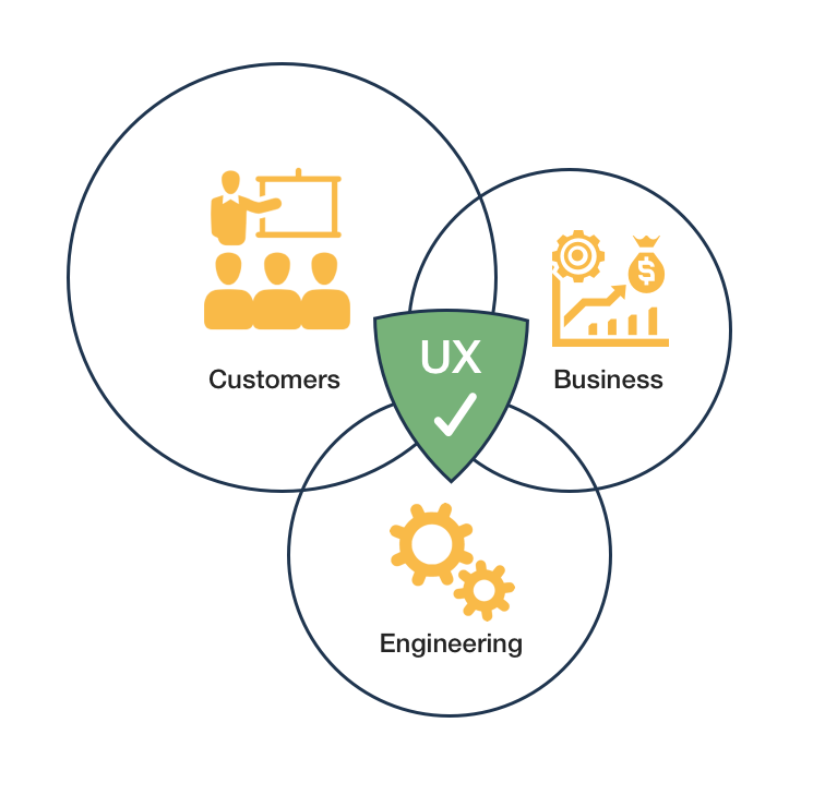
I shared research findings and documentation with the cross-functional team to clearly define user needs and pain points.
I performed, documented, and presented a heuristic analysis of the current UXUI display and user flows associated with each LMS being supported.
I analyzed the unique codebases implemented by the individual dev teams for the 4 LMS environments. I presented key differences and visual inconsistencies to the Dev Managers.
GOAL SETTING
Give educators what they are asking for.
Allow university admins and instructors end-to-end Course Setup from within the Learning Management System used at their schools.
Simplify the current process allowing adoptions, capabilities, and services to be displayed from within the LMS embedded in the university websites.
Use APIs, single-source CSS, and components to deliver a seamless experience the carried the brand.
Remove all complexity to reduce time on task.
ENSURING SUCCESS
Defining the ecosystem
Multiple product teams would need to tightly collaborate in order to pass the proper, secure data into the APIs used in the dynamic page builds.
I created and presented diagrams and schematics that clearly laid out the ecosystem and dependencies.
The documentation* was centralized and shared between the stakeholders, management teams, and engineering.
*proprietary information
IDEATION
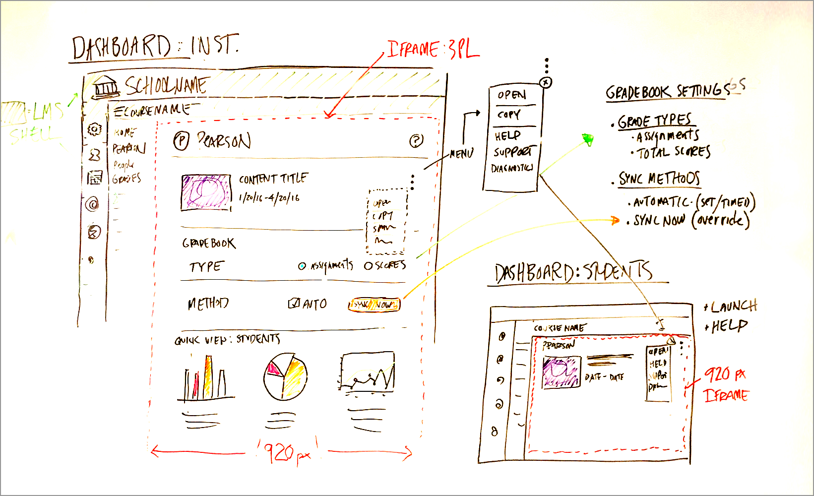
Napkin drawings.
Generating ideas through collaboration.
Simplifying the user experience was paramount to the success of the project. Ideating on a singular inline experience would drive the design direction.
I led drawing and whiteboard sessions with UX peers to gather varied ideas and interaction concepts.

IDEATION
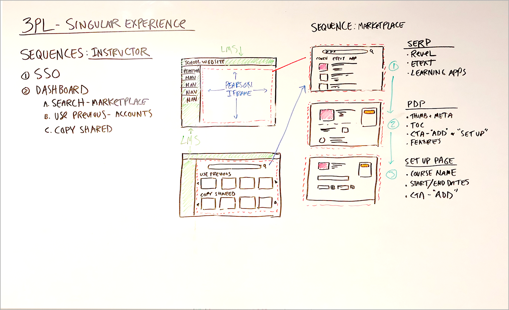
Framing it all out.
Creating a clear understanding of the inline sequencing.
Using Sketch, I created wireframes based on the whiteboard session designs adhering to the new design system and branding guidelines.
I presented the UXUI to stakeholders and the cross-functional team. The seamless user experience met user, as well as business needs. The Development team agreed to share a single CSS source.

PROTOTYPING
High-fidelity prototypes and live clickthroughs.
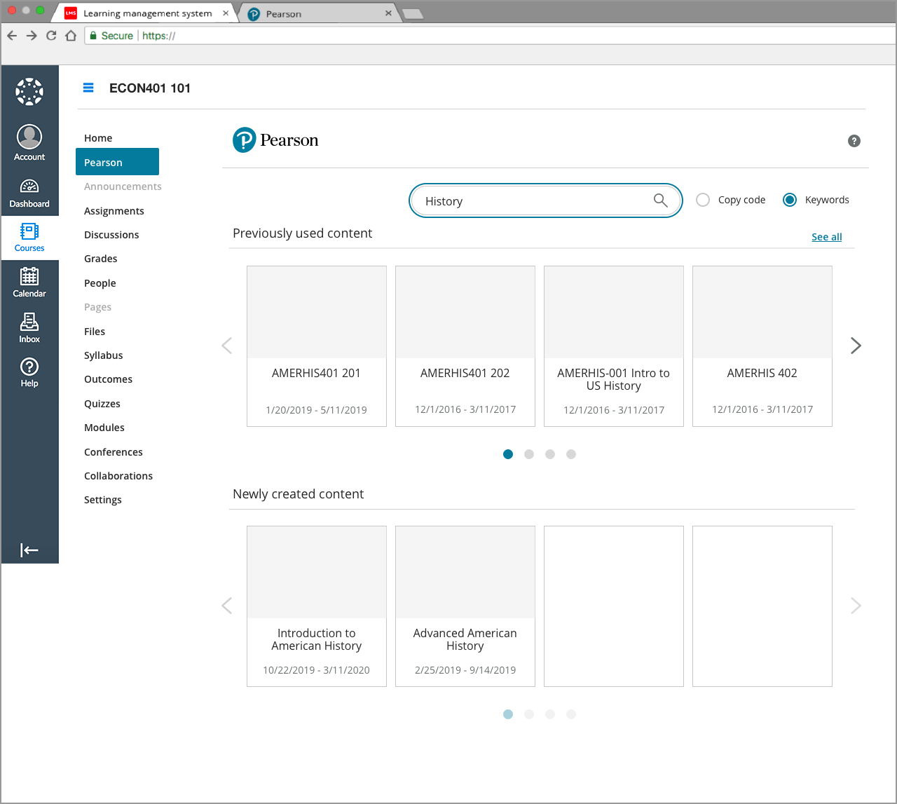
With the interaction and page sequencing defined, live product shots and metadata were used to create final prototypes using Sketch.
Using InVision, highly interactive clickthroughs were created simulating a live experience.
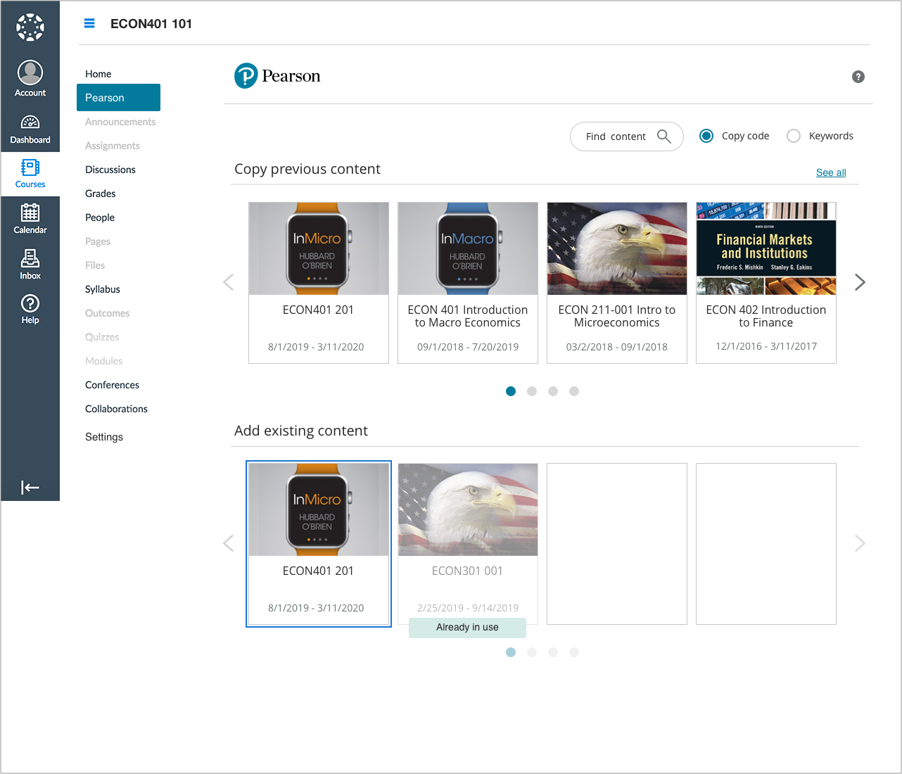
SEAMLESS CONTENT INTEGRATION
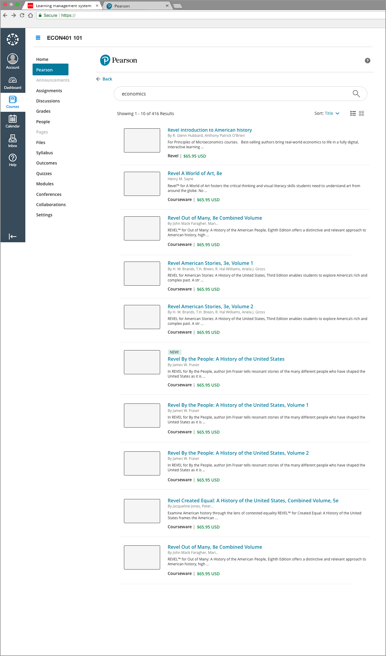
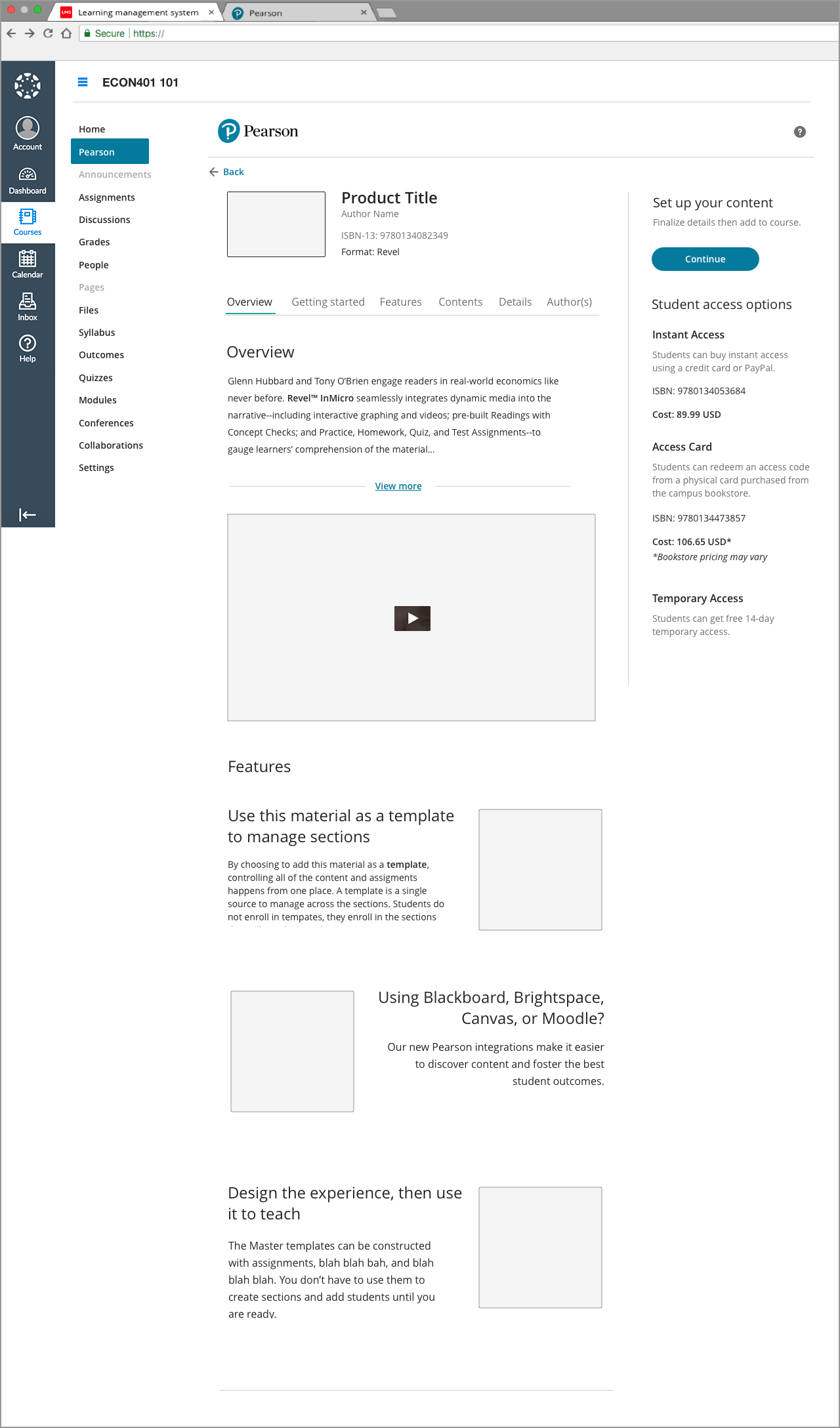
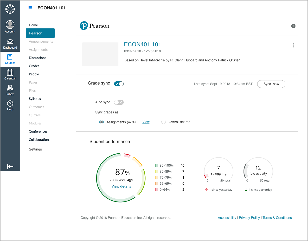
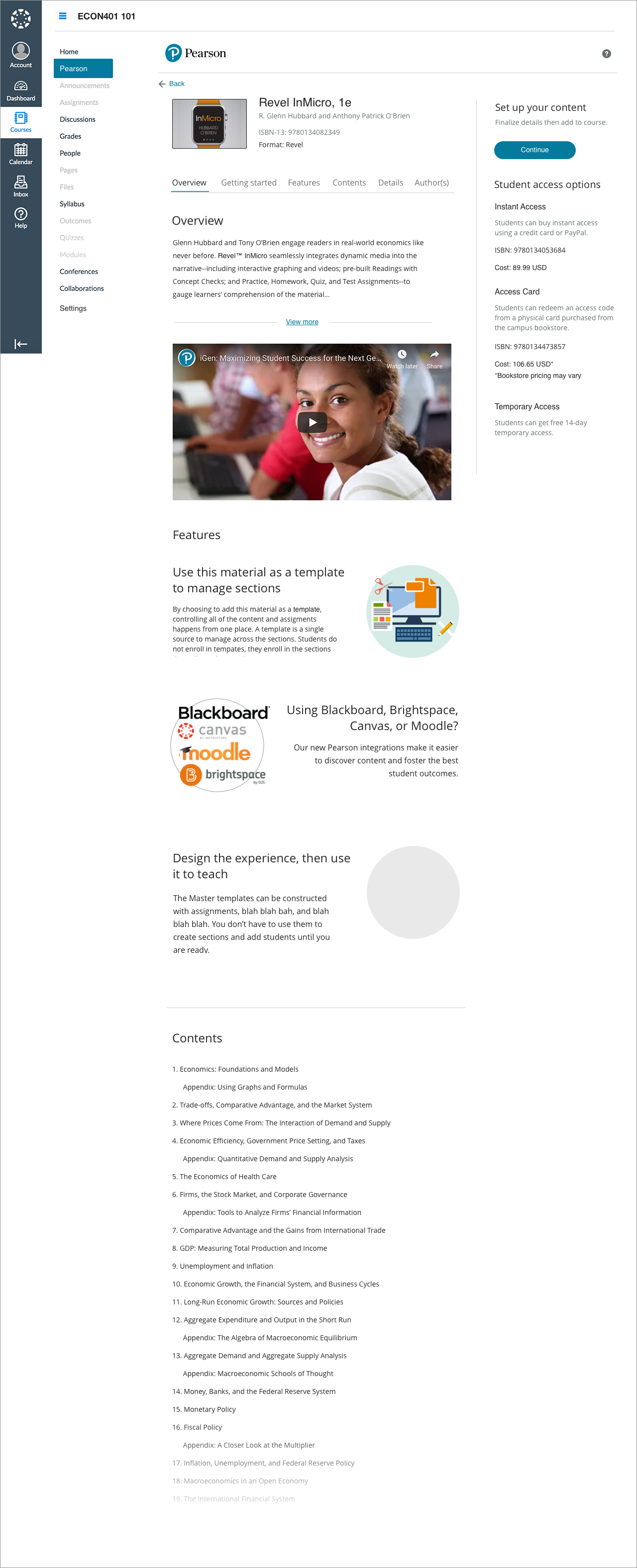
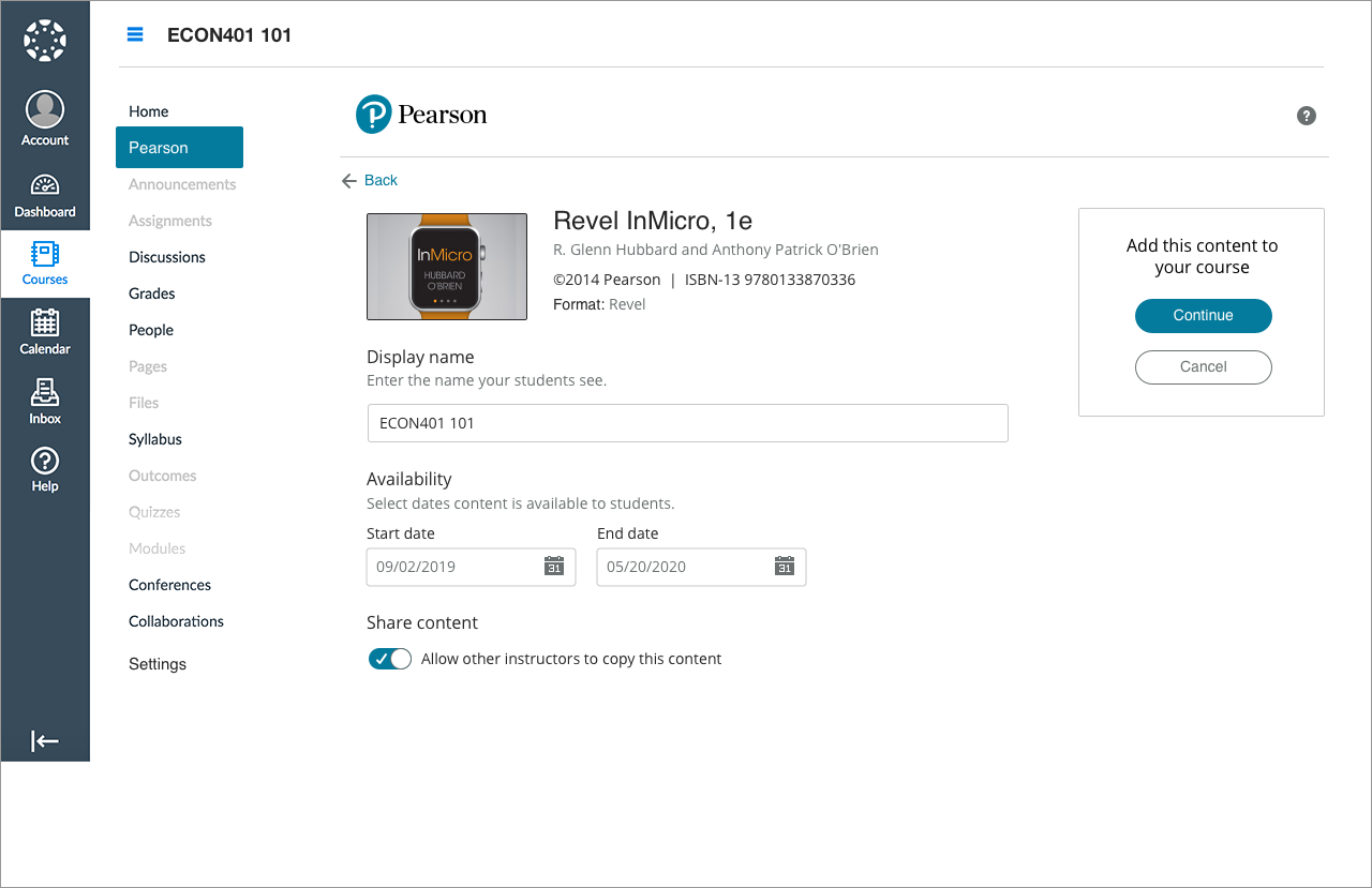
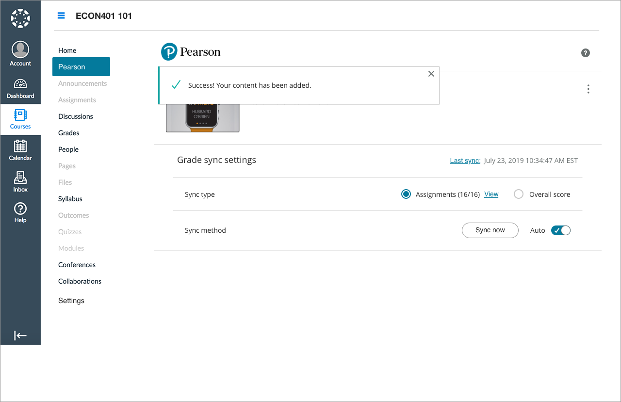
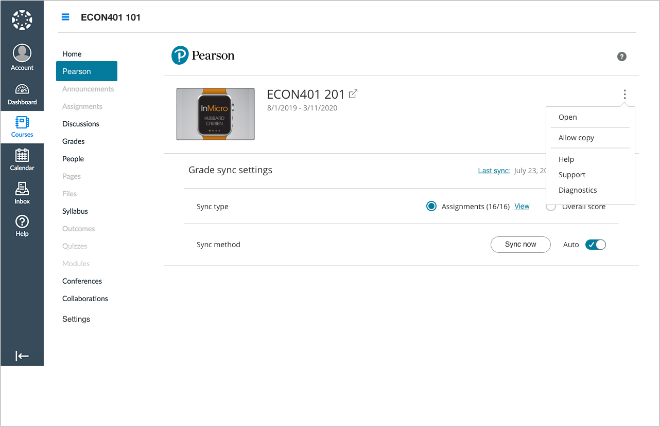
Instructor Dashboard: Search, discovery, and adoption


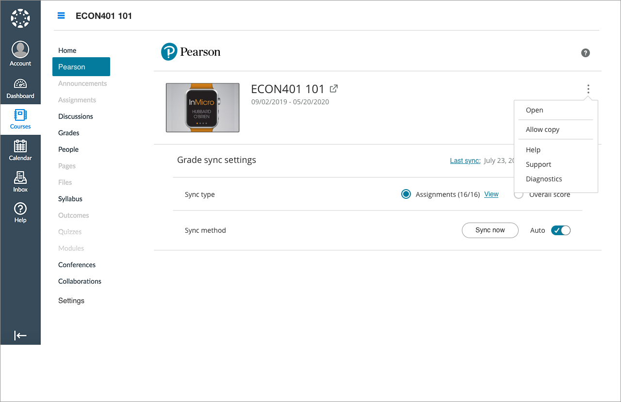
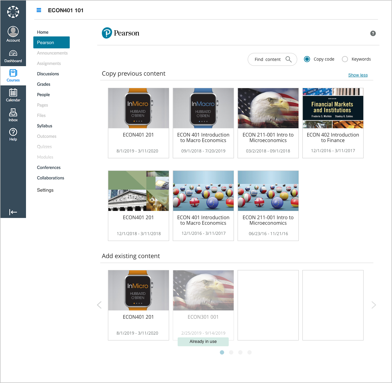
SEAMLESS CONTENT INTEGRATION
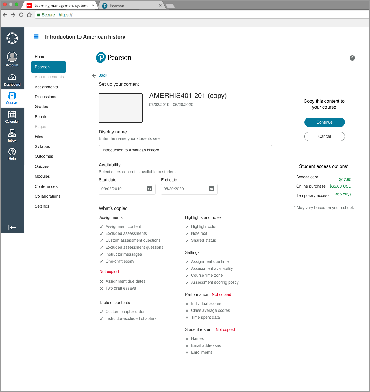
Instructor Dashboard: Reusing previous content

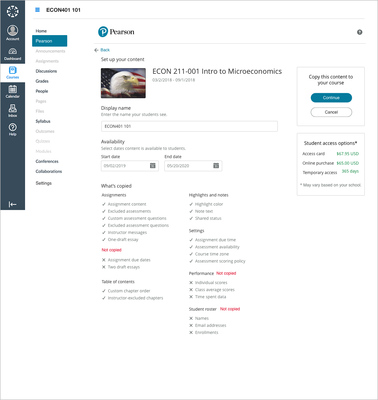
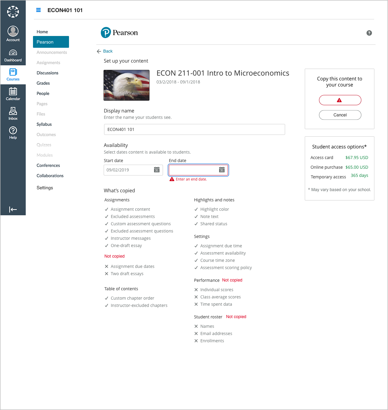
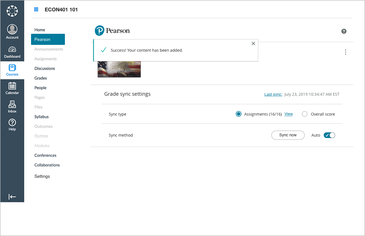

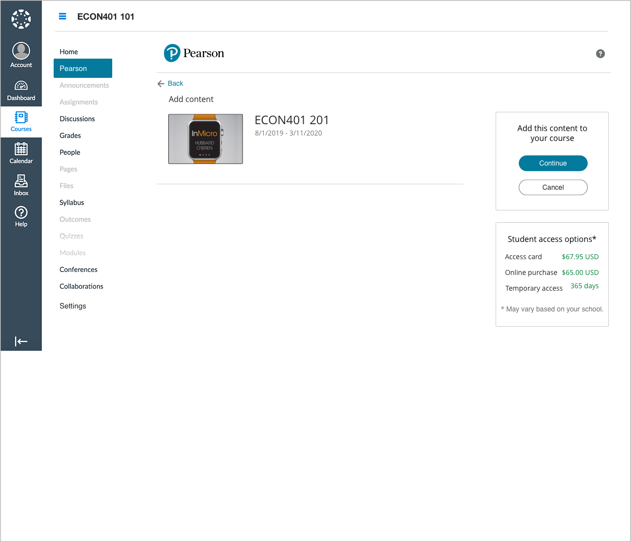
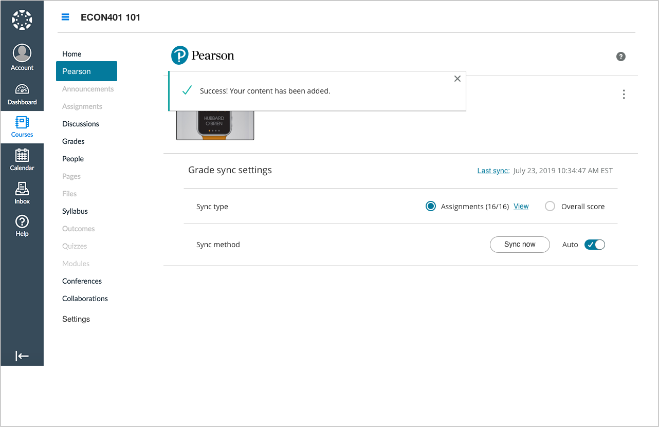
SEAMLESS CONTENT INTEGRATION
Instructor Dashboard: Linking content
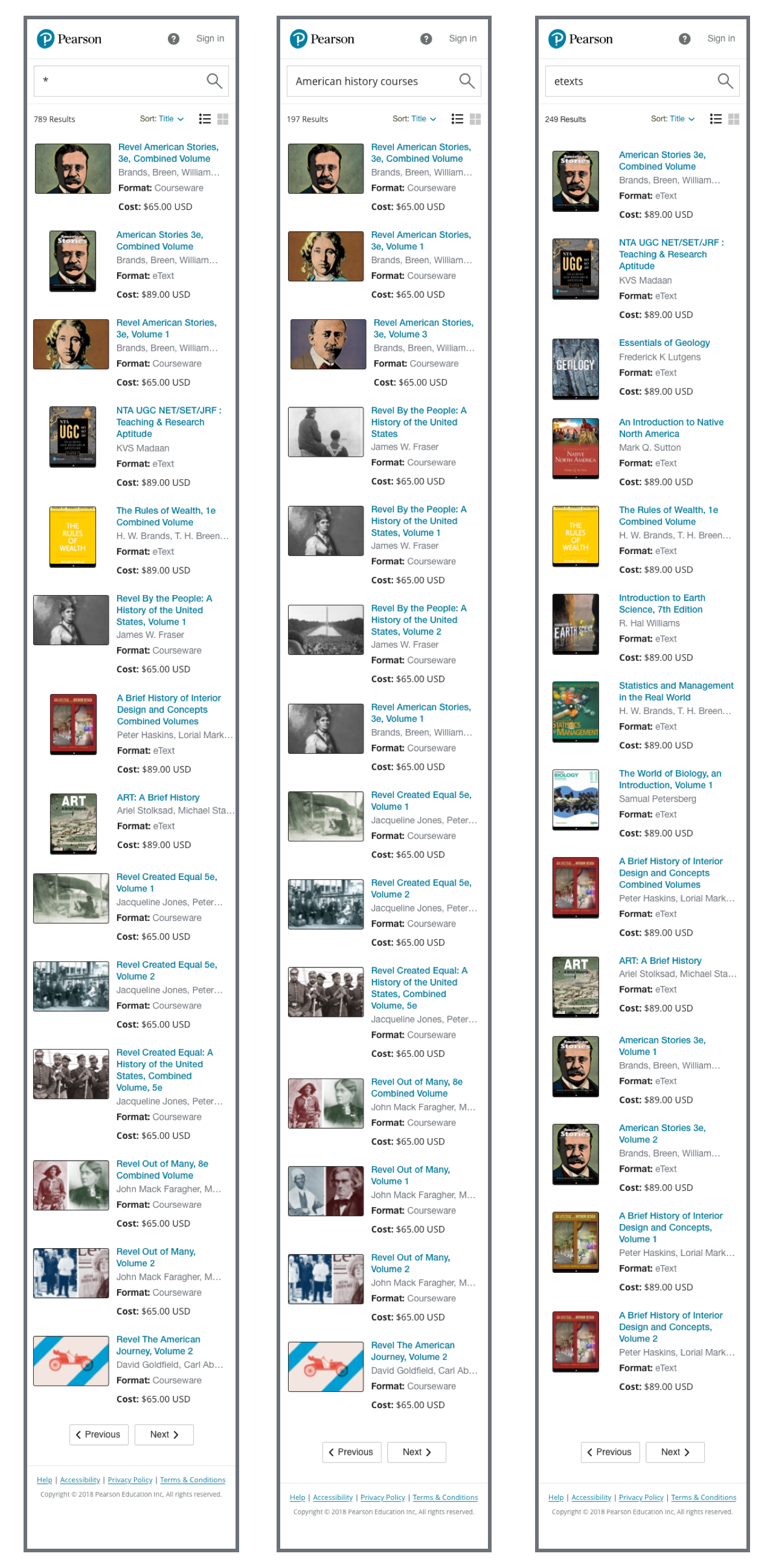
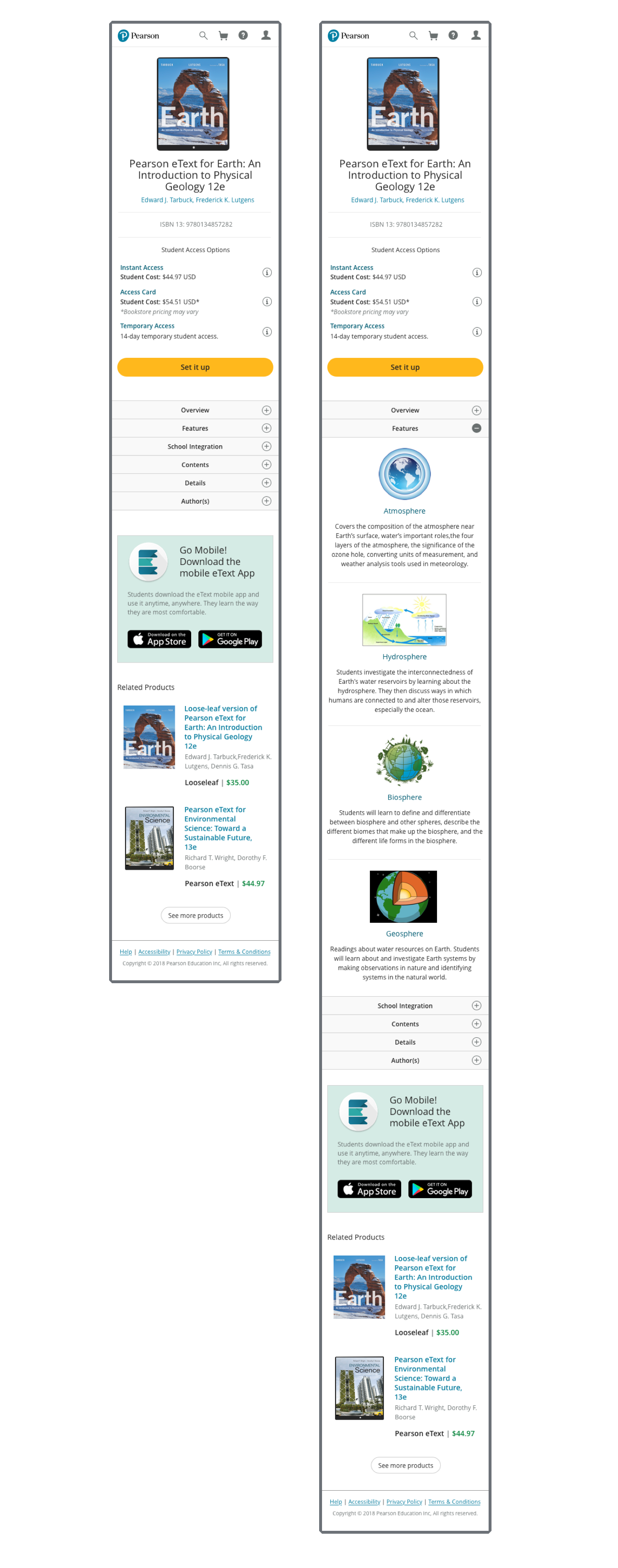
RESPONSIVE DESIGN
Search and Discovery: SERPs and PDPs


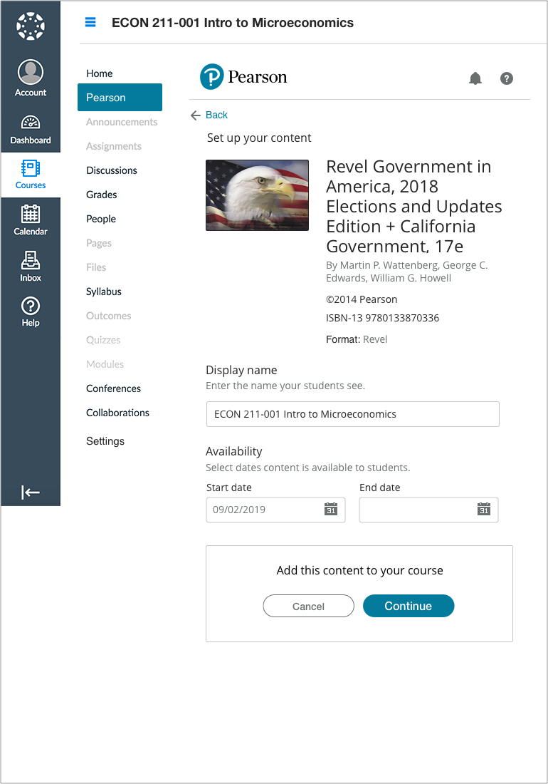
RESPONSIVE DESIGN
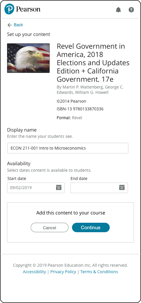
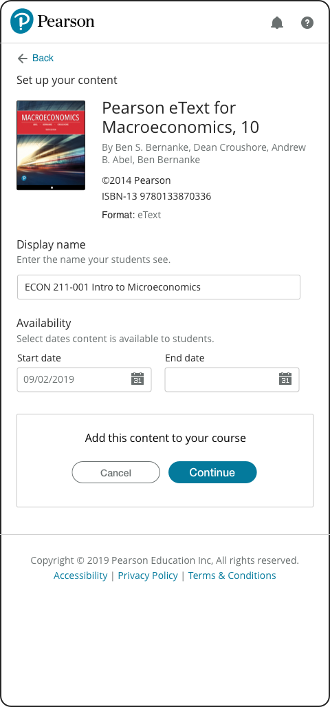
Setting up content: Tablet
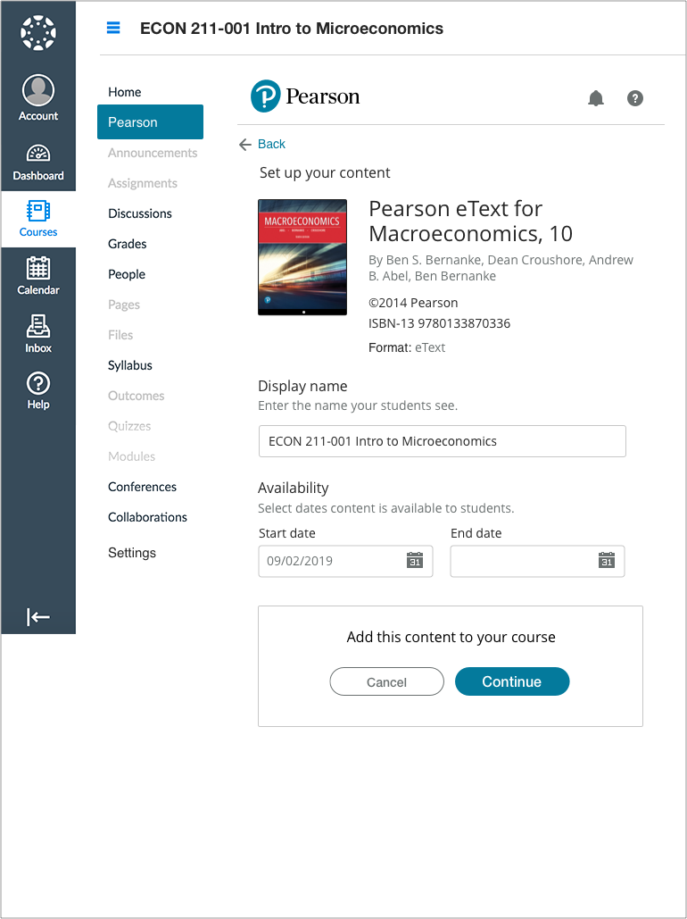
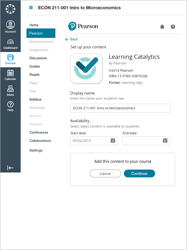
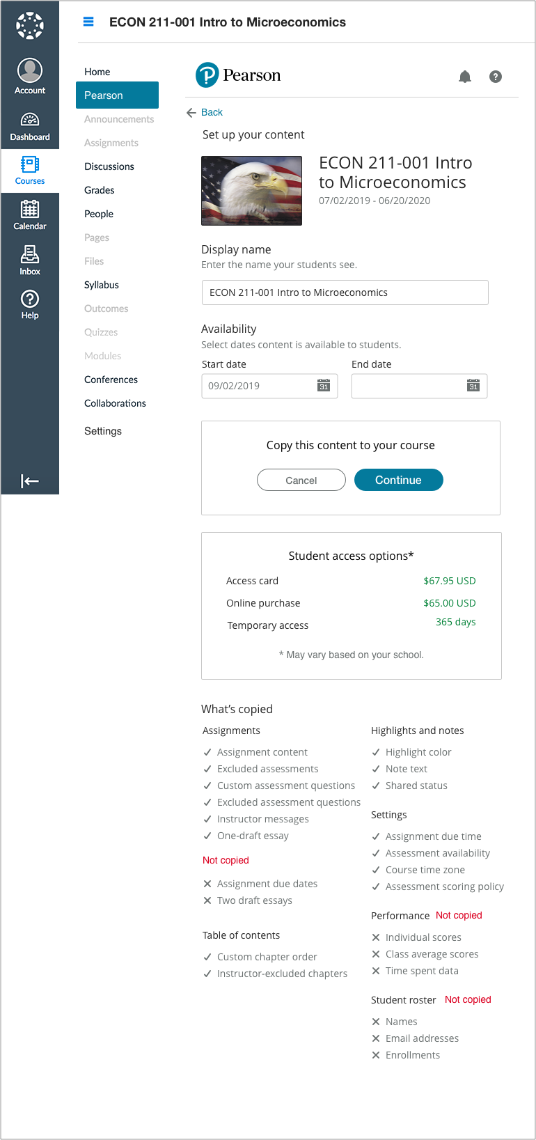
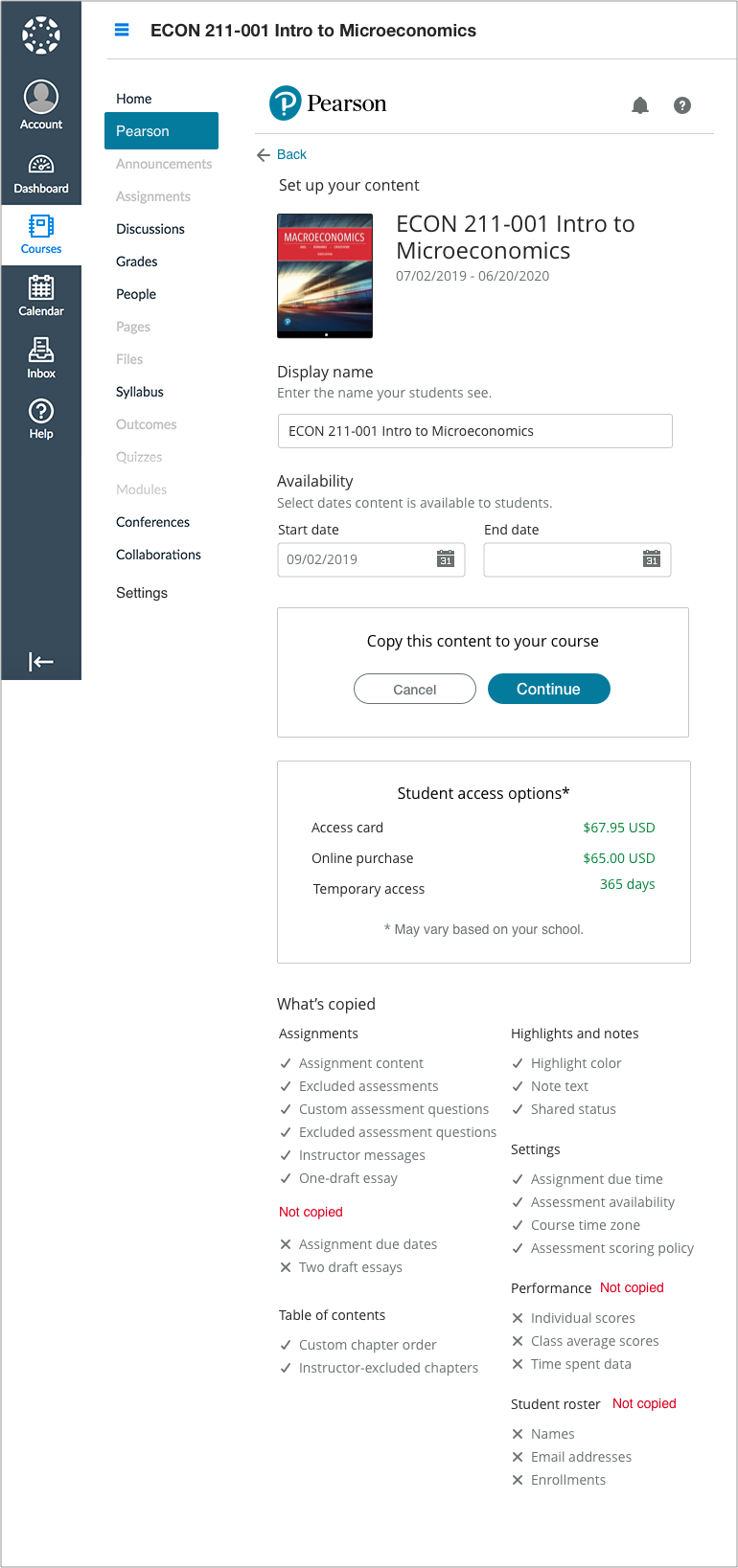
RESPONSIVE DESIGN
Setting up content: Mobile




USER TESTING
End to End Testing
Putting the new screens and inline workflows in front of users to confirm my hypothesis.
Usability and Likeability
Using InVision, I created a clickthrough that mirrored the live experience in development.
Tasks were given to 10 instructors who already used our products that included installing the Pearson app, finding specific content from the Marketplace, and final set up of the course content.
KPIs to be measured
Task Success Rate
Time on Task
System Usability Scale (SUS)
5ST Methodology
Results
90% of instructors found the system easy to navigate and less timely than the current version.
The subjects unanimously preferred the new workflow.
SUS ratings received an average of 9 (second highest) amongst all participants.
All participants thought the page designs were visually pleasant and welcoming.
Some instructors had difficulty selecting the sample content. This was attributed to unfamiliarity with the US History product samples used. The instructors used for the testing taught other disciplines such as Arts or the Sciences.
Outcome
The new design and workflows met 85% of user expectations.
All of the test subjects thought the simplified onboarding experience was quick and easy, giving them more time to create their lesson plans.
No revisions would be needed for the in-flight development.
The updates were successfully released according to schedule.
RELEASES
We listened to users, and it paid off.
During the next 3 years of iterative design enhancements, usage grew at a steady rate. The market share increased from 16% to 63%. The platform was generating over 125M dollars in annual revenue.
How did we know?
Using a mix of Product Support data, Google analytics, and follow-up interviews, the data showed the platform design to be successful in meeting user needs.
User time on task dropped significantly.
Follow-up interviews revealed onboarding completion for search, reuse of previous material, and copying previous course material to be a simple, elegant process with few issues.
Product support calls fell over 40%.
Existing customers were very happy with the new single-page design.
Adoptions grew over 47%.
CHALLENGES
The road ahead.
The Visual Design System was being designed for a single product line.
LMS integration was about information and data. It lived inside of university sites that had their own color schemes. Generic versions of the design system were required to alleviate visual clashing.
Offering more than one product line from within an LMS was frowned upon.
Product owners for eTexts and Learning Apps had were not approved to offer their courseware to educators or students.
Educators specifically asked for content that included ways of teaching that used many different types of materials to create their course curriculum.

